Devlog 008: Behind the Design
The thinking behind how draftmount.com looks: a planner instead of a dashboard, navy instead of black, three typefaces with three jobs, and a few rules I won’t bend.
· Draftmount Development Journal
Hello again, writers!
This one is for anyone who has looked at the website and wondered why it looks the way it does. Why grid paper? Why is nothing black? Why is there tape on everything? Every one of those was a decision, and this post walks through the thinking behind each one.
A note on the pictures. I didn’t keep my early drafts, so I can’t show you old versions. Instead, I took the live page, switched each decision off, and photographed both. The “before” in each pair is the same page with the design stripped back to a plain template, which is roughly where most product pages start. The “after” is the page as it is today.
The idea everything hangs on
Draftmount’s design starts from one sentence: it should feel like the planner a writer keeps.
Writers already have a favourite object. It’s the notebook with the cracked spine, the planner full of sticky tabs, the printout covered in pen. Those things feel personal in a way software rarely does. Writing apps tend to look like either a blank text box or an airline cockpit. I wanted the third option: something that looks like it belongs on your desk next to the mug.
So the website is built as a planner. The background is grid paper. Your draft is a white sheet taped onto it. Each part of the app has its own coloured index tab. Progress shows up as a round sticker, and when you hit your goal for the day, a rubber stamp lands on the page. None of it is decoration for its own sake. Each piece stands in for something software usually shows as a grey box or a progress bar.
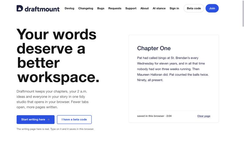 Switched off: a plain template
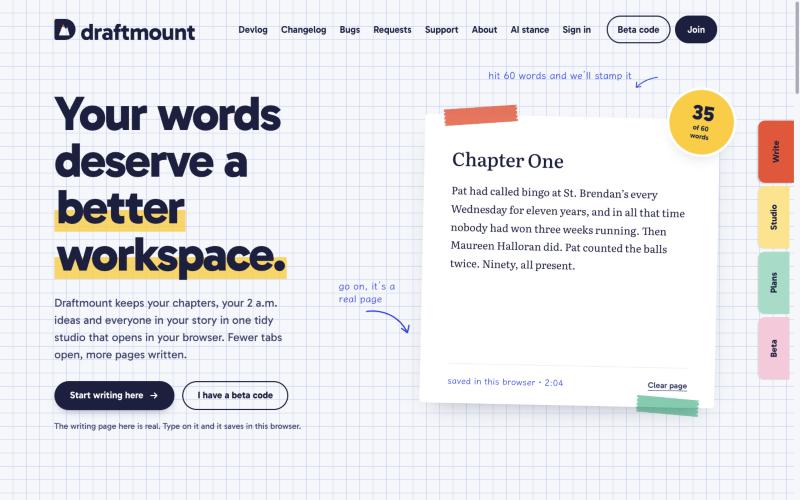 As built
The plain version isn’t bad. It’s clean and readable. But it could be selling anything. The planner version could only be selling a place to write.
Four principles I check everything against
Before any colour or font, I wrote down what Draftmount is for. Every design decision since has had to pass these four:
- Words first. Every screen should get you back to the page faster. If something slows a writer down on the way to writing, it goes.
- One place. The draft and everything around it (ideas, characters, places, goals) live together. You shouldn’t need four tabs open to write one chapter.
- Zero setup. A new writer should be typing within a minute. That’s why the top of the home page is a real writing page you can type on before you’ve signed up for anything.
- Rhythm over pressure. Goals and streaks are there to encourage you, never to scold you. A missed day isn’t a failure; a rest day is part of the plan.
That last one shapes more of the design than you might expect. You won’t find red warnings about falling behind, or a number turning angry when you miss a day. The site leads with what you’ve done, not with the gap.
Paper first
The grid paper is a 24-pixel grid of thin periwinkle lines. It’s quiet enough to disappear while you read, but it tells you straight away that this is a working surface, not a brochure.
On top of it sit the sheets: plain white pages with soft shadows that make them look like they’re resting on the desk, not floating above it. A few of them are tilted by a degree or so, as if someone put them down by hand. The writing sheet on the home page has one rule I hold onto hard: its centre stays clear. Tape, stickers and notes go on the edges and in the margins. The middle belongs to your words.
Navy ink, and no grey anywhere
There is no black and no grey on draftmount.com. Every piece of text, every line and every shadow is the same navy ink at different strengths.
Pure black on white is harsh over a long read, and grey tends to look washed out and unsure of itself. Navy reads as ink from a good pen. It’s calm, it has some warmth to it, and it still looks professional. The lighter text you see (captions, small print, hints) is a tint of that same navy, never a neutral grey.
Pretty colours mean nothing if people can’t read them, so the tints are checked for contrast. The secondary text is 7.4 to 1 against the page and the smallest print is 5.2 to 1, both comfortably past the usual accessibility guideline of 4.5 to 1. Even the shadows are navy at low strength, so nothing on the page goes muddy.
Three typefaces, three jobs
The site uses three typefaces, and each one has exactly one job.
- Gabarito is Draftmount’s own voice. It sets the headlines, the buttons and everything you click, and the wordmark is drawn in it too. It’s rounded and confident in heavy weights and friendly at body size.
- Klee One is the handwriting: the little notes in the margins, the “saved in this browser” line, the labels on the tape. It’s the pen you scribble with, and it only ever marks notes and status. It never sets a button or a heading.
- Literata is your book. It’s a serif made for long reading, and it’s kept for the manuscript and nothing else.
Keeping the jobs separate means you always know what you’re looking at. If it’s in Literata, it’s writing. If it’s handwritten, it’s a note. If it’s in Gabarito, it’s the product talking.
One colour per tool
Each part of the studio owns one colour. Writing is tomato red, chapters are butter yellow, ideas are mint, cast is periwinkle and goals are pink. A tool’s tape, its tab, its sticker and its highlights all use its colour, and a new tool gets a new colour rather than borrowing one.
The bright colours are only ever used as fills. When a colour needs to be text, it switches to a deeper version of itself (deep tomato, deep mint, deep pink), because pastel text on white is hard to read. And where two strips of tape overlap, they blend into a third colour, the way real washi tape does. That’s how the page shows two tools working together, like a note pinned to a chapter.
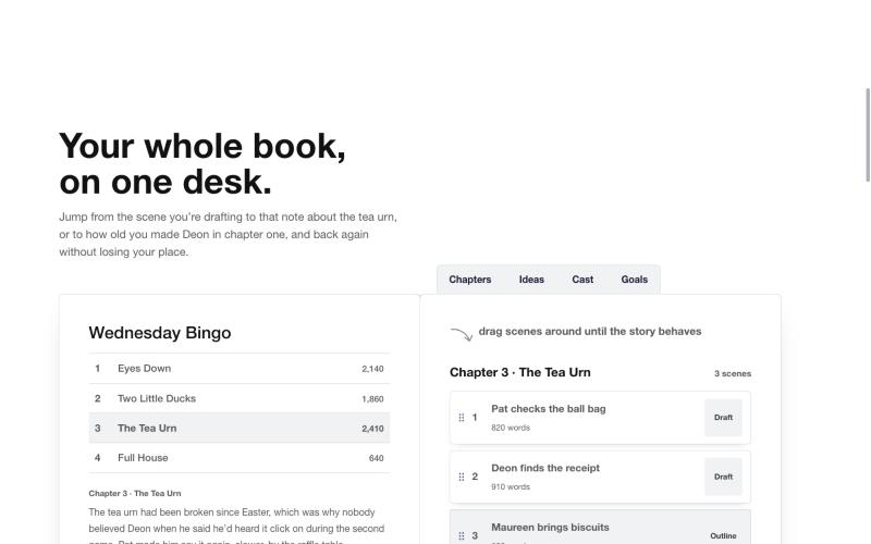 Switched off: a plain template
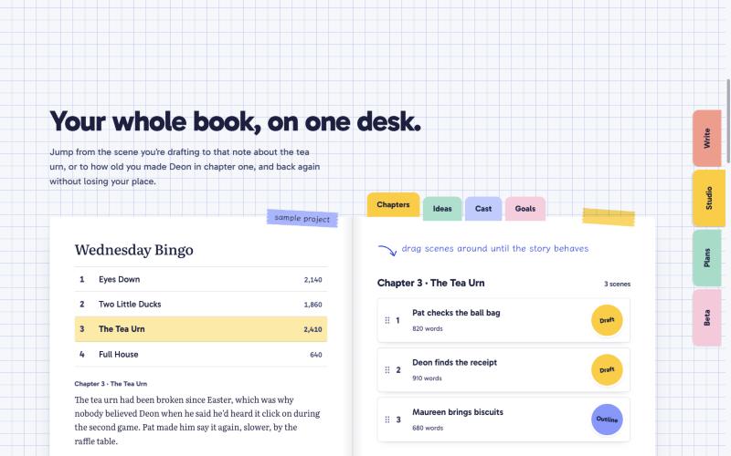 As built
Show, don’t tell
Most product pages explain themselves with a row of feature cards: an icon, a heading, two lines of text, repeat. I decided against that. Draftmount’s home page shows you the thing working, and points at it with handwritten notes and arrows, the way you’d annotate a page for a friend.
The writing page at the top is real. Type on it and it saves in your browser. The sample project below it is laid out like a real book, with chapters, scenes and word counts. Words are cheap on a landing page; letting you try it is how I’d rather earn your trust.
Only three things move
Motion is fun to add and easy to overdo, so I limited it to three: tape peels and sticks back down, stickers pop when they change, and the stamp presses onto the page when you reach your goal. Hover colours can fade, but nothing slides in from the side, nothing floats and nothing bounces while you’re trying to read.
If your device asks for reduced motion, all of that switches off completely.
The logo
The mark is what I call the Summit D: a capital D whose inner space is a two-peaked mountain range. The tip of the main peak is tomato red, so it reads as a summit and also as the point of a freshly sharpened pencil. Finishing a draft really does feel like climbing something.
Beside it, the name is set in lowercase Gabarito Bold. Lowercase because Draftmount should feel approachable, bold because it should still feel sure of itself. I wanted the brand to look professional, so the logo is a mark, not a character, and it’s only ever used in a small set of approved colours.
Honesty is a design decision too
Some of the most important choices on the site are things you won’t see.
There are no testimonials, user counts, ratings or press logos on draftmount.com, because Draftmount is brand new and I don’t have any yet. I would rather leave that space empty than fill it with something made up. The plans section shows real prices, but there’s no buy button until the store is ready; a handwritten line says the store opens soon. And the new bug tracker, feature requests and changelog are public on purpose, so you can see what’s broken, what’s planned and what’s changed without having to take my word for it.
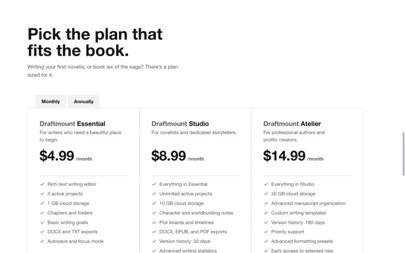 Switched off: a plain template
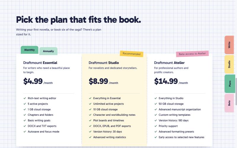 As built
Made to be used by everyone
A few rules apply on every page, and they aren’t up for negotiation:
- Everything you can click or type into shows a clear blue outline when you reach it with the keyboard.
- Text contrast stays well past the accessibility guidelines, including the small print.
- Reduced motion is respected everywhere.
- Pastel colours are never used for text.
- Selected text gets a soft yellow highlighter, like the one in your pencil case.
The words matter as much as the pixels
The design includes the writing. Draftmount’s voice is warm, plain and encouraging, with short sentences. The tagline is “Your words deserve a better workspace,” and the closing line is “Your next chapter starts here.” Buttons say what they do. Error messages say what went wrong and what to try next. Nothing on the site should make you feel silly for not knowing something.
Rules I won’t bend
Every design system collects rules, and these are the ones I keep coming back to:
- No grey and no black. If a colour can’t be written as navy ink at some strength, it doesn’t belong.
- One colour per tool, always.
- Each typeface keeps its one job.
- The middle of the writing page belongs to the writer.
- Show the thing working instead of describing it.
- Never claim something that isn’t true yet.
Every new page has to follow them, including the ones added this week. The bug tracker and changelog sit on the same grid paper, in the same navy, with the same three typefaces.
What’s next
The design will keep changing as real writers use Draftmount and tell me what works and what doesn’t. If something on the site looks off, or a page is hard to read, the bug tracker is right there in the top bar. I read every report.
Until the next draft,
The Draftmount Developer
- Design status
- Website design system written down and applied to every page
- Focus
- Planner world, navy ink, three typefaces, one colour per tool, accessibility
- Next
- Refining the design with feedback from beta writers